|
|
Name of Artist: Milton Glaser
Date of Birth: June 26, 1929
Personal Background: He attended the High School of Music & Art, graduated in 1951 from the Cooper Union, received a scholarship, and studied at the Academy of Fine Arts in Bologna. In 1954, Glaser and his fellow graduates of the Cooper Union founded Push Pin Studios, which helped shape the direct of graphic design. In 1968, Glaser and Clay Felker founded New York Magazine, where Glaser was the designer up until 1977.
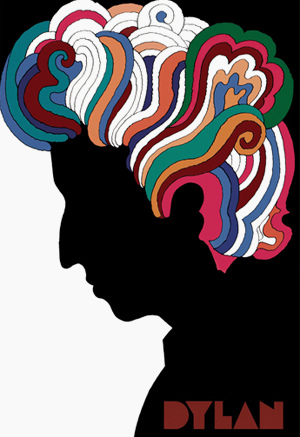
Style: Many of Glaser's works have some form of historical aspect to them. Some (most notably, I <3 NY) have clean and simple lines that are reminiscent of Keith Haring. Many also appear to have psychedelic influences, such as the Bob Dylan poster and the Mad Men advertisements.
Philosophy: Glaser tries to find a balance in his work. He says that he was awfully inspired by Giorgio Morandi and Pablo Picasso. He says that it's interesting and difficult, as these men were total opposites. Morandi was simple, and lived that way. Picasso was a narcissistic and self-absorbed man, only interested in himself.
Influences: Morandi has incredibly iconic work. It can be seen everywhere. At once, his work is simultaneously simple and complex. It says what it needs to say and moves on, but has a hint of something more. I think that's an incredibly complex thing to accomplish and it's something that I strive to do.
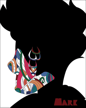
Compare and Contrast: I tried really hard to mimic what I loved about the Bob Dylan poster, the swirling designs, the striking colors, the elegant simplicity. His work remains more simple than mine, more interesting and captivating. His colors seem more vibrant, despite being the same as mine. This can probably be attributed to the placement of them, the precision with which color goes where. His design also seems lighter, the swirling lines being free and trailing away in flowery designs, but my design seems static. Nothing moves. Nothing feels.
Artist Statement: I wanted to create a tribute to an artistic movement I find fascinating, the art of the 60s and 70s. Many of my favorite artists were heavily influenced by the politically heavy 60s and 70s, an era of new artists and growing tension. A era of breaking free and the movements that came with. A brand new world where people were free to express themselves with the art they created. I read much of this into the Bob Dylan posters whose psychedelic patterns always bring me to the bright skylines of New York in the height of it's artistic revolution. I only wish to instill my emotions about the history into others, and I hope that with hard work, I'll be able to acheive this.
Date of Birth: June 26, 1929
Personal Background: He attended the High School of Music & Art, graduated in 1951 from the Cooper Union, received a scholarship, and studied at the Academy of Fine Arts in Bologna. In 1954, Glaser and his fellow graduates of the Cooper Union founded Push Pin Studios, which helped shape the direct of graphic design. In 1968, Glaser and Clay Felker founded New York Magazine, where Glaser was the designer up until 1977.
Style: Many of Glaser's works have some form of historical aspect to them. Some (most notably, I <3 NY) have clean and simple lines that are reminiscent of Keith Haring. Many also appear to have psychedelic influences, such as the Bob Dylan poster and the Mad Men advertisements.
Philosophy: Glaser tries to find a balance in his work. He says that he was awfully inspired by Giorgio Morandi and Pablo Picasso. He says that it's interesting and difficult, as these men were total opposites. Morandi was simple, and lived that way. Picasso was a narcissistic and self-absorbed man, only interested in himself.
Influences: Morandi has incredibly iconic work. It can be seen everywhere. At once, his work is simultaneously simple and complex. It says what it needs to say and moves on, but has a hint of something more. I think that's an incredibly complex thing to accomplish and it's something that I strive to do.
Compare and Contrast: I tried really hard to mimic what I loved about the Bob Dylan poster, the swirling designs, the striking colors, the elegant simplicity. His work remains more simple than mine, more interesting and captivating. His colors seem more vibrant, despite being the same as mine. This can probably be attributed to the placement of them, the precision with which color goes where. His design also seems lighter, the swirling lines being free and trailing away in flowery designs, but my design seems static. Nothing moves. Nothing feels.
Artist Statement: I wanted to create a tribute to an artistic movement I find fascinating, the art of the 60s and 70s. Many of my favorite artists were heavily influenced by the politically heavy 60s and 70s, an era of new artists and growing tension. A era of breaking free and the movements that came with. A brand new world where people were free to express themselves with the art they created. I read much of this into the Bob Dylan posters whose psychedelic patterns always bring me to the bright skylines of New York in the height of it's artistic revolution. I only wish to instill my emotions about the history into others, and I hope that with hard work, I'll be able to acheive this.
